Color Theory for Fashionistas
By: Courtney Singleton
Not many consider the science behind colors when picking out an outfit, but they should. Color Theory is the study of the relationships between colors, also known as hues.
Did you know certain colors make us feel certain emotions? According to arttherapyblog.com, warm colors bring feelings of warmth, anger, or comfort while cooler colors are associated with calmness or sadness.
It’s not a coincidence that yellow, the color associated with happiness, is often the choice when illustrating a traditional smiley face. Nor is it just fate that Valentine’s Day colors are red and pink, colors that spark feelings of romance. Have you ever wondered why we wear black at funerals? Colors play into our psychological effects.
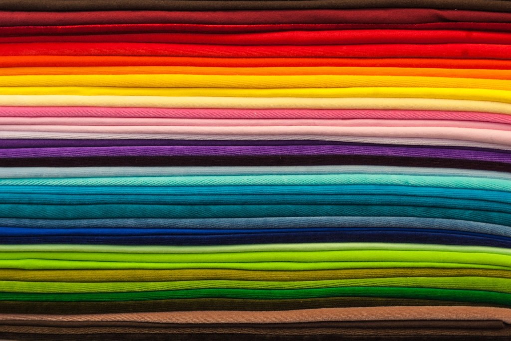
Use of colors plays a vital part in art and design of all forms – graphic design, interior design, marketing, painting, and fashion to name a few. Understanding the color wheel and rules associated with color is essential to putting ease on picking out the perfect OOTD (outfit of the day) for IG.
You can determine which tones look best by the color of your vein. Warm tones look best if you have green veins, indicating you have a warm undertone. People with blue veins are generally best suited for cool tones.
The color wheel is a tool used by visual artists everywhere when coordinating color harmony amongst the 12 colors. There are three primary, three secondary and six tertiary colors. Red, yellow and blue are the three primary colors. Purple, orange and green are secondary colors. Secondary colors sit between each of the primary colors on the color wheel and are composed of equal parts of two primary colors. Tertiary colors are a mix of primary and secondary colors.
Basic Color Schemes
The easiest of the seven basic color schemes is monochromatic, the use of one color. Think of an all-white affair, which gives a sophisticated look when done properly. After all, it was Coco Chanel who started the monochromatic fashion trend. Wearing the same color may be overbearing, so try playing with your silhouette and varying shades or saturations to create contrast.
If you aren’t a fan of color, you may want to explore the achromatic color scheme. This works with colors that fall within the category of a greyscale. White, grey and black can be worn in style and solidarity outside of the office setting or if you feel like taking a risk you can explore and expand to incorporate pops of color.
Analogous colors sit next to each other on the color wheel. It’s just that simple.
Complimentary colors are directly across each other on the color wheel. Think Planet Fitness’ branding of purple and gold or the green and red of Christmas. Fun fact: Alpha Kappa Alpha Sorority, Inc. incorporates complimentary colors with pink and green. Pink is just a lighter shade of red!
Now that we understand complimentary colors, let’s talk about split complimentary. This is where you take a color and use the colors that reside to the left and right, or analogous, of its complimentary. In fashion, the two analogous colors would be identified as the accent colors of the phenomenal outfit.
Finally, we have the triadic color scheme, the use of colors that are equally distant in the color wheel. You will know if you’ve done this scheme correctly if the coordinated colors form a perfect triangle on the color wheel (hence the name “triadic”).
There are many other concepts behind color coordination, but these basic rules are easy enough for anyone to follow.